Mobile friendly website design
Mobile Friendly
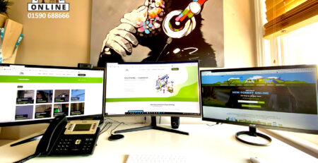
New Forest Online has undergone a number of changes over the past year – not the least of which is the completely re-designed website, now responsive (mobile friendly) and more intuitive. A mobile-friendly website is one that works just as well on a smartphone (such as an iPhone) as it does on a desktop computer. Some websites offer completely separate mobile-only sites, whilst others (such as NewForest-Online.co.uk) actually redesign themselves ‘on the fly’ to suit smaller screens. The latter means that you see exactly the same web page as a desktop user would see – but laid out differently for ease of use.
What makes an argument for mobile-friendly website design extremely powerful is the news that an incredible 4 out of 5 of the 24 million Britons who log onto Facebook every day are using a smartphone or tablet computer. Since millions of links to external websites are pasted into Facebook every day, it’s reasonable to assume that these millions of users are also browsing the internet at large in the same way. This mass movement towards using mobile phones to browse the internet is gathering unprecendented momentum.
Creating a mobile-friendly version of your website could therefore mean the difference between winning a customer and losing them to a competitor.
Call 01590 688666 to discuss creating a Mobile-Friendly website